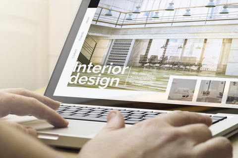
 Whilst it might not seem that obvious as first, the interior designs of our homes are being impacted by our experiences online. From websites to apps, we are constantly bombarded with ‘design’ and this is impacting on the way we are furnishing and decorating our homes.
According to ABC News, Australians are big users of the web, spending on average nearly seven hours each day on phones, tablets, and computers. The research carried out in 2018 shows that sites like Reddit, Facebook, Ebay and Tumblr all rank in the top ten when it comes to the sites where Australians spend most of their time. The top 50 sites, however, is made up of a diverse range of websites and it is the design and layout of these website that is having an impact on the way we design the interior of our homes.
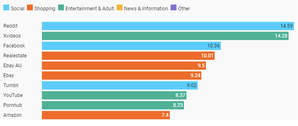
Image source: ABC News
How interior designers are influenced by the web
Interior designers understand the relationships between colour, layout, and functionality in a home or office. A website designer also needs to understand the same relationships when it comes to the actions they want people to take when they visit a website.
No matter which industry you are based in, the way your content is presented on your website is important and is often the first touch point a prospective customer has with your brand. If it doesn’t have an attractive layout, or if certain features don’t lead them to the information they need, they will quickly bounce off your site and find a site that does meet their needs.
The design and layout of your site should create a natural flow for users, just like good interior design helps people to flow from one room to another and it is this user flow on websites that is helping to inspire interior designers today.
A focus on muted colours and grains
According to Sheila Bridges of Sheila Bridges Home, “Wallpaper and pattern play will continue to dominate” and will be two of the biggest interior design trends in 2021. Correspondingly, we are seeing similar trends in web design. A recent post by Webflow analysed some of the biggest website design trends for 2021 and highlighted the use of grainy textures on websites rather than the use of rigid grids and flat blocks of colour which “can really drain the personality from a web design”.
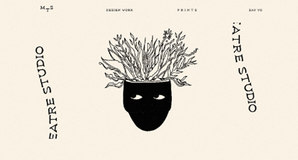
Other trends that cross over between interior design and website design in 2021 include the use of muted colours. Magic Theater Studio, uses a light colour palette, along with dark blocks of green, making for a distinct contrast between sections of this web design. These muted colours are the perfect backdrop to the hand-drawn styled text and illustrations.
According to Sheila Bridges, “Everyone can be transported through the use of pattern and colour (muted and grounded shades mixed with brighter and more hopeful colours like yellows or bright greens).”
Standing out in a crowded market
As the Australian housing market continues to grow in strength, homeowners looking to sell are turning to interior design in order to help their home stand out from the crowd. According to The Guardian, overall housing finance in Australia in December was 31% above where it was 12 months ago, “suggesting house prices around the country are set to rise faster than they have any time in the past decade”.
This has prompted homeowners to turn to interior design in a bid to help their home stand out from the rest in what looks to be one of the busiest years for housing sales in recent times.
In a similar way, website designers are constantly looking for ways to make their website stand out from the crowd. When you consider the amount on online content consumed throughout Australia every single day, it’s not easy to create a design that is both memorable and one that leads to a conversion.
There are some industries that are doing it well. Casino websites, like Betway, tend to stick to intuitive designs, often with a bright font colour on a dark background. Vibrancy and design come through the range of online slots and table games that can easily and regularly be updated by the casino platform. Games like Starburst, Cleopatra, and Thunderstruck II demonstrate that flexibility – each has its own unique theme and colours, and the platform’s colour scheme helps this to stand out.
This is a pattern replicated across other entertainment industries. If we think of some of the major TV streaming platforms in Australia, most follow a similar pattern. Netflix has a focus on a dark background with bright red colour font. Amazon Prime is similar, with a clean white logo but a dark background helping the content on the page to stand out. Stan is another popular streaming platform in Australia and they also have a dark background and bright blue elements where they want you to click.

Interior designers are taking inspiration from the use of bright colours which can help a space to ‘pop’ and really grab someone’s attention, a trend picked up from website design.